In order to design the best symbol and identity of Tehran, we were looking for a unique symbol for Tehran. But the choice of any symbol would harm the integrated attitude of all aspects of Tehran and not include a part of the audience.
It was to think of an idea to depict the spirit of solidarity and dynamic interaction that flows in all the elements of the city instead of using a symbol.
Why this symbol?
We believe that this sign, along with the signs of city brands, has something to say, has graphic value and has enough potential to introduce the city of Tehran.

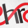
Like Tehran, this form has both complexity and a coherent and simple whole. this gaming with graphic values gives an identity like Tehran.
By avoiding sharp edges and using a soft and twisted line as the main form of the sign, it has been tried to induce a sense of inclusion and kindness. Apart from fellow citizens, this feeling is also a reminder of Iranian hospitality for tourists.
As a dynamic logo, this element has the ability to change color, line thickness and elongation and is flexible to suit different situations.


